Cubie
A full brand identity for a daily essentials retailer built around a cast of five character mascots — each designed to give young consumers a personal stake in the brand.
The Brief
Cubie is a daily product retailer targeting young consumers — a market that responds less to product specs and more to personality. The brand needed an identity that felt alive, not just designed. Something customers could feel ownership over before they even made a purchase.
The challenge was building recognition without a single hero product. Every item Cubie sells is functional and replaceable. The brand itself had to be the reason to choose them.
The Approach
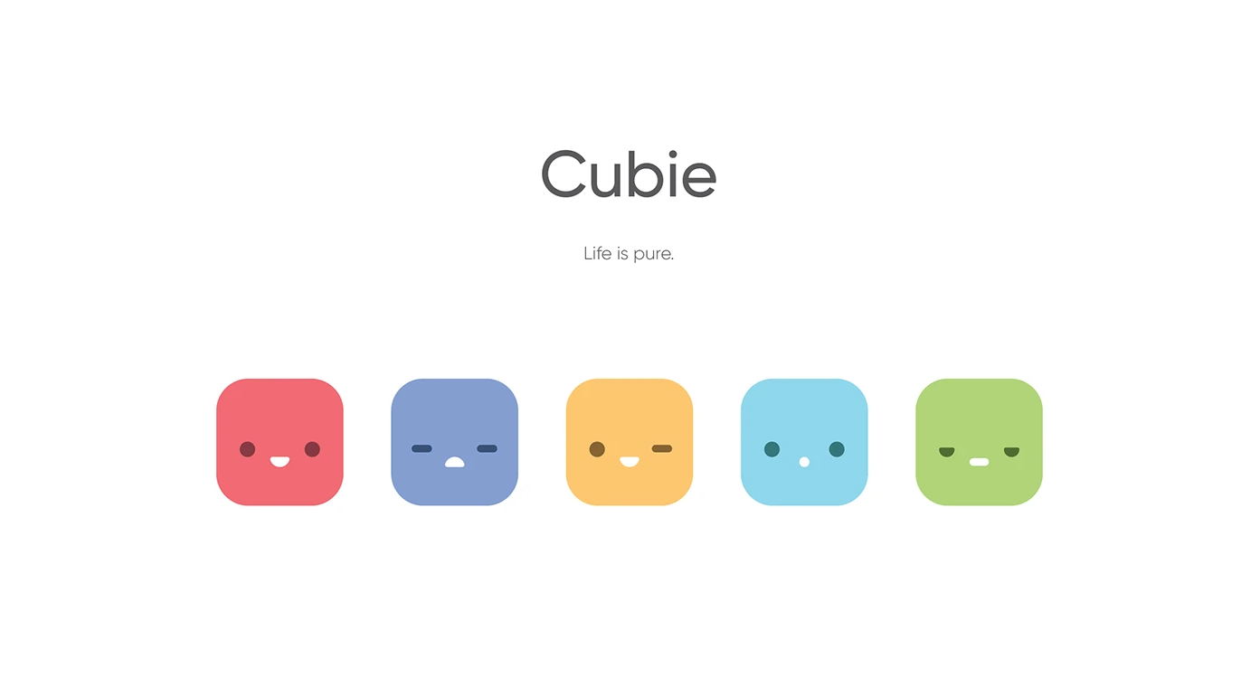
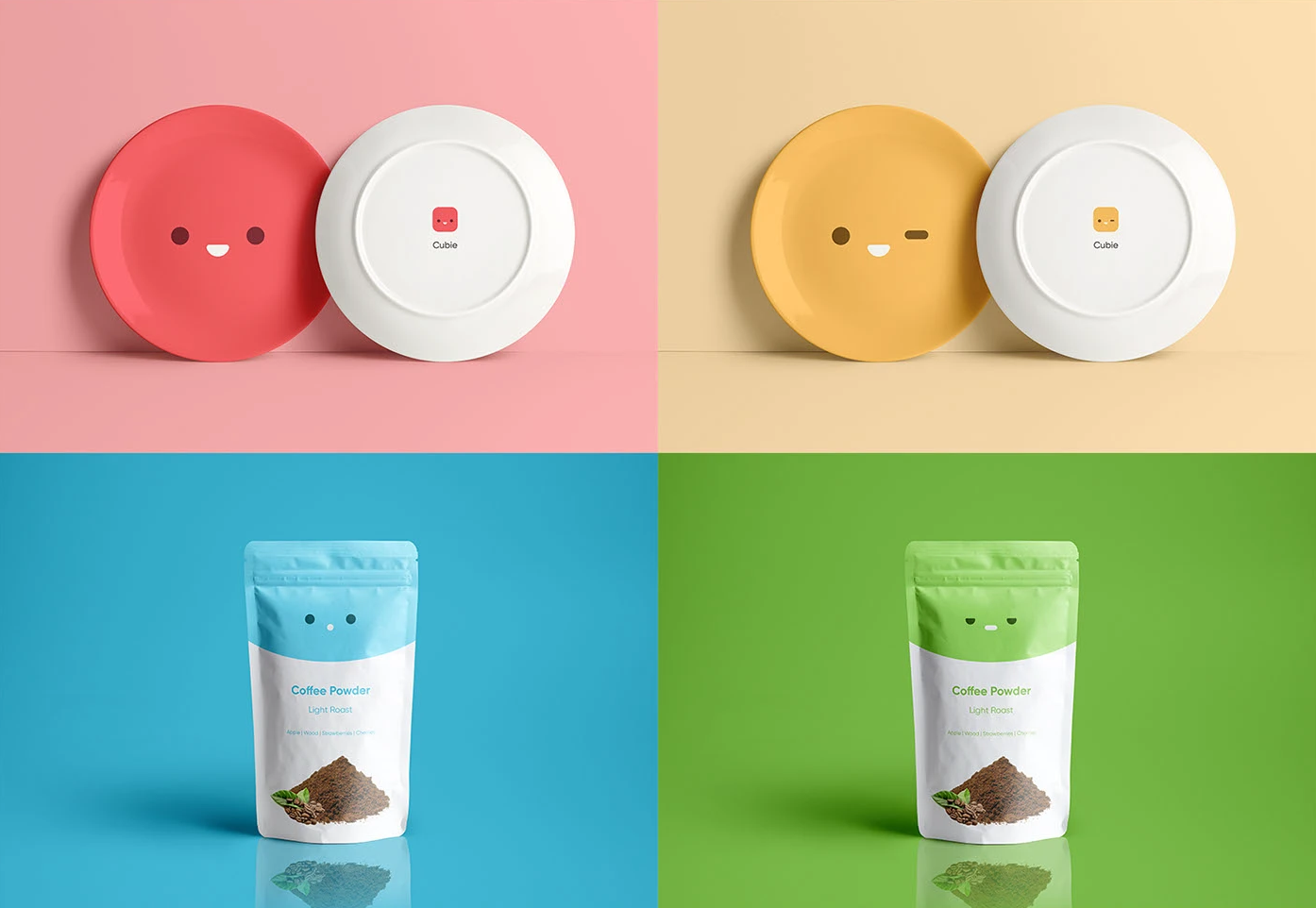
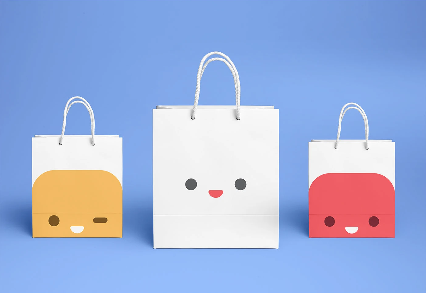
The core of the identity is a system of five cube characters — each with a distinct color, expression, and personality. Rather than a single mascot, the ensemble gives customers a choice: which one are you? This mechanic drives both emotional attachment and repeat engagement, as each character rotates across product surfaces and packaging.
The design language was kept deliberately minimal — clean geometric forms, a restrained type system, and a palette built around the five character colors. The simplicity ensures the characters read clearly at any scale, from shelf labels to tote bags, without competing with the products themselves.
The result is a brand that feels approachable and fun without relying on trend-chasing. The character system gives Cubie a visual vocabulary it can extend indefinitely — seasonal editions, collaborations, and limited runs all have a natural home within the framework.