
Yawaka Ice Cream
Brand identity for an ice cream concept built around softness, customisation, and the uncomplicated joy of a well-made cone. The name says it all — yawaka means "soft" in Japanese.
The Brief
Yawaka wanted an identity that made people feel something before they tasted anything. The product model is built around customisation — customers build their own cone from a selection of flavors and bases — so the brand needed to convey both warmth and playfulness without tipping into childish.
The reference point the client kept returning to was a specific feeling: the opening titles of a 90s cartoon. Immediate, colourful, confident. Nothing trying too hard.
The Approach
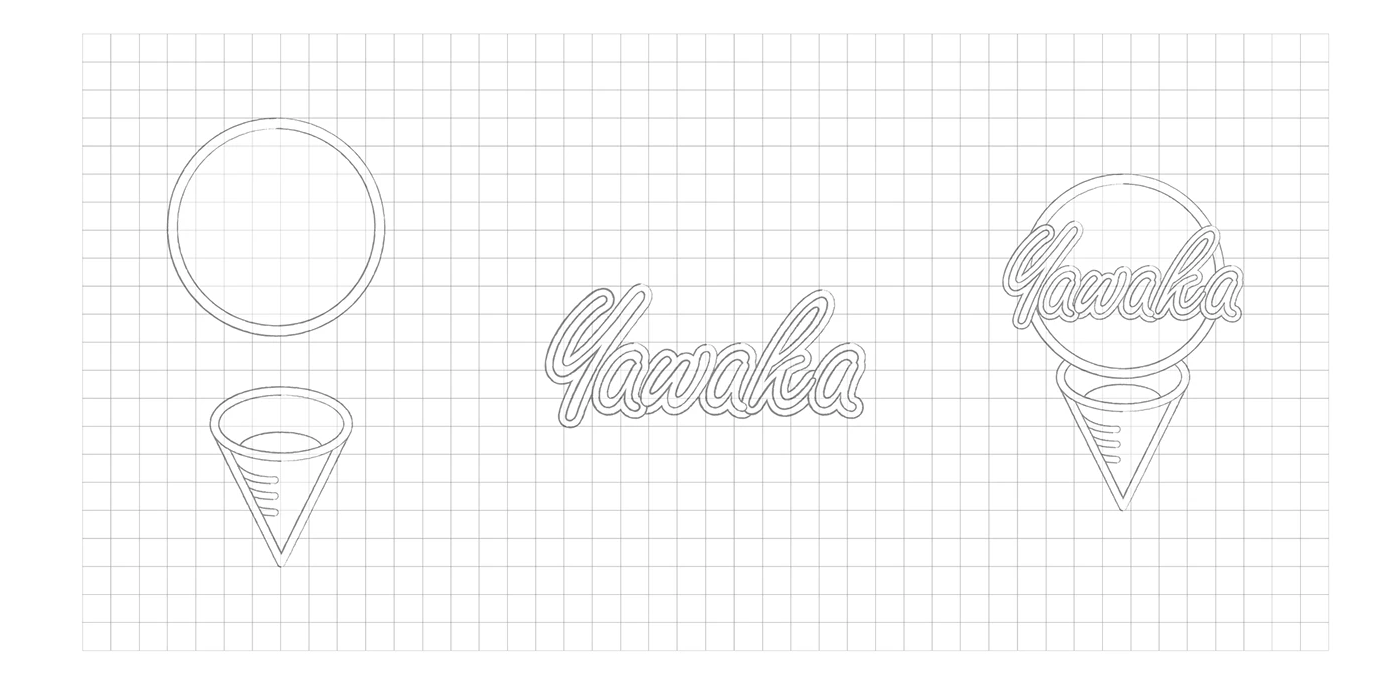
The logo leads with an illustration of an ice cream cone — rendered simply enough to be iconic, with enough warmth to feel handmade. A rounded, handwritten-style typeface carries the same softness as the product name itself. Together they create a mark that communicates what Yawaka is in under a second.
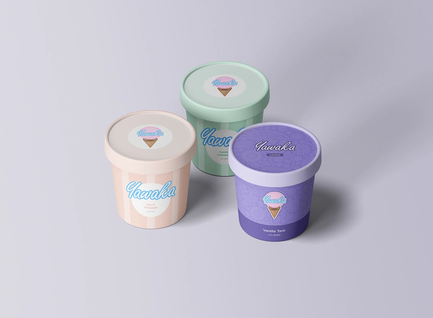
The color palette was built around warm, muted tones that suggest natural ingredients and approachable sweetness — deliberately avoiding the hyper-saturated neons common in the category. Every element, from type weight to corner radius, was calibrated to reinforce the core brand feeling: soft, comfortable, a little bit joyful.
The result is an identity that scales from a storefront sign to a single-use cup without losing character — flexible enough to grow with the brand, distinctive enough to hold its own on a crowded street.